On March 8, 2021, food stylist Lisa Cherkasky presented several great tips for taking your restaurant or business food photography to the next level. Lisa has worked with restaurants and stores, such as California Tortilla and Giant Food, as well as national publications, such as Washington Post and National Geographic. During her presentation she’ll take a look at real photographs taken by our local restaurants and provide practical feedback on how restaurants can ensure their food looks as delicious on screen as it does in person!
This free event was provided by the Columbia Pike Revitalization Organization (CPRO) as part of its Columbia Pike Business Roundtable series.

Lisa has been a professional Food Stylist and Food Writer for more than 30 years. She has worked with restaurants and stores, such as California Tortilla and Giant Food, as well as national publications, such as Washington Post and National Geographic.
lisacherkasky@gmail.com
202.812.5472
Instagram: @lisacherkasky


Use Natural Light
Harsh, fluorescent lighting can make objects appear “flat” and 2-dimensional
Place objects beside windows for soft, directional lighting; Darker objects should be placed closer to the light source than lighter objects
If natural light is not an option, use a small lamp to one side of the subject rather than flooding it with overhead lighting; use Night mode on your phone (stabilized as best you can) to let in more light
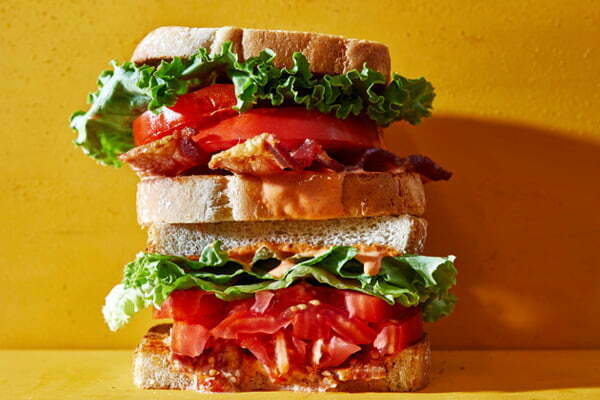
Simplify Your Background
Remove distracting objects and keep the focus on your primary object
Use poster boards or hang table cloths behind your subject when busy backgrounds can’t be avoided
Simplify your subject as well by keeping the main dish in the foreground and any side dishes off to the side or in small bowls as props in your background
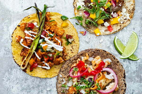
Show Off Ingredients
If it is difficult to understand what ingredients are in the dish, find fun ways to show them off (e.g. photograph a burrito before it is rolled, show a sandwich from the side or without its top bun)
On social media and websites, use your captions to explain what the viewer is seeing and avoid creating an expectation that the dish is served in this way (e.g. “Take a look inside our burritos”).

Create Depth Without Distraction
Use complementary items in your background or to the sides as props around your subject
Props should always be relevant to the primary subject
Use Portrait or Selfie mode on your smartphone to slightly blur the background and keep the focus on your primary subject
Examples: place more of the same item in the background, use ingredients as props, add coasters or cutlery that would come with the subject
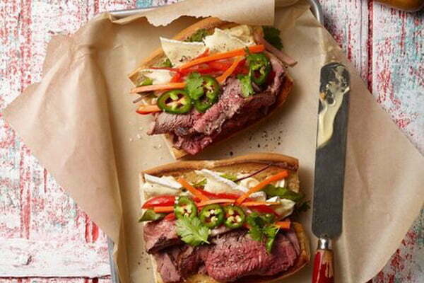
Capture An Experience
Take “behind the scenes” photos of food preparation
Capture “action” and don’t be afraid to get a little “messy” (e.g. photograph carbonated drinks immediately after pouring to capture the bubbles, show cheese melting down the side of a hot sandwich)
Show props during or after use (e.g. place a knife with a condiment on it beside a sandwich, place a fork in a bowl of pasta rather than just beside it)
Ensure food looks fresh by capturing it quickly after it is prepared; keep oil or water and small brush handy to add moisture and shine to food as it becomes dry
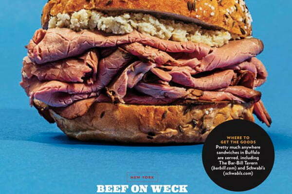
Plan Ahead
Have a list of images you to capture in order of priority
Make all decisions about lighting, placement, and props before bringing out food to ensure freshness
Take close-up images first to capture the most detail while food is still fresh
Take photos with simple backgrounds, empty space, and the entire subject in frame for images that can be used in multiple ways (cropped for social media, horizontal for a website header, or empty background extended for the placement of text)
Capture different angles for variety
Take close-up images first to ensure you capture food when it is freshest

Depth & Focus With Your Phone
Use portrait or selfie mode to blur backgrounds
Don’t zoom in, get closer to your subject
Zooming in can create grain in your photo
When using Portrait or Selfie mode to blur your backgrounds, get closer to your subject to ensure it remains crisp and your phone can properly detect the subject’s edges
Experiment with the various modes and settings on your phone to find what works best for your subject
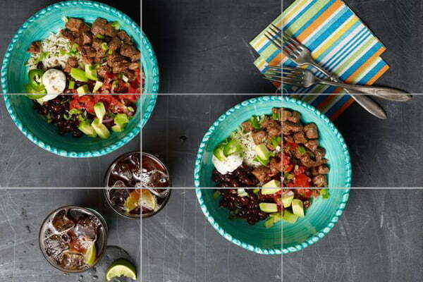
Use Your Phone’s Grid for Composition
iPhone: Settings > Camera > Grid
Android: Open Camera > Settings > Grid Lines/Type
Using the “rule of thirds” places objects at the intersection of grid lines for more dynamic composition than placing subjects in the center

